<!DOCTYPE html>
<html lang="en">
<head>
<meta charset="UTF-8">
<meta http-equiv="X-UA-Compatible" content="IE=edge">
<meta name="viewport" content="width=device-width, initial-scale=1.0">
<title>小米</title>
<link rel="stylesheet" href="./css/reset.css">
<link rel="stylesheet" href="./css/mi.css">
<link rel="stylesheet" href="./css/iconfont/iconfont.css">
</head>
<body>
<!-- 头部开始 -->
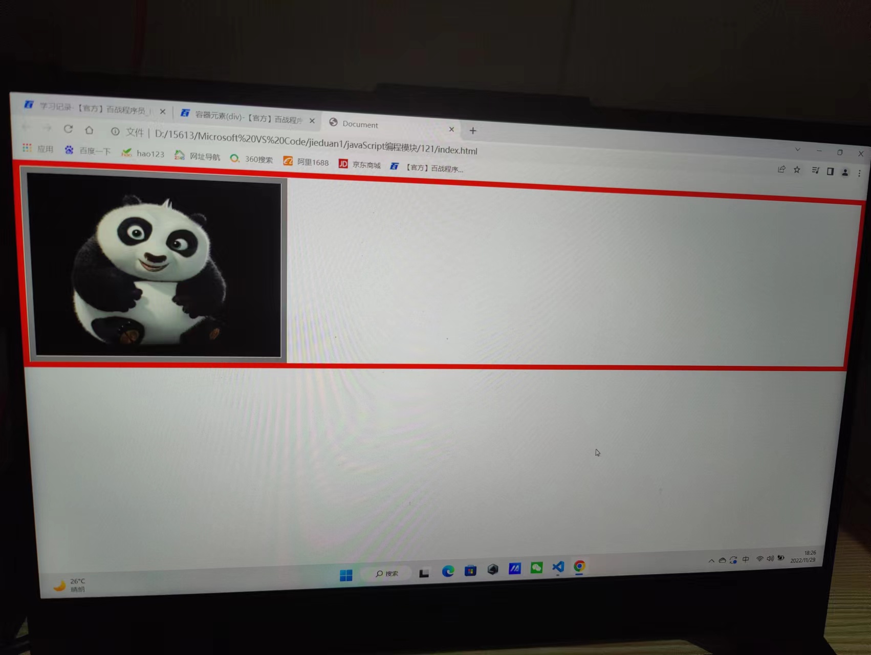
<div class="header">
<a href="#">
<img src="./images/top.jpg" alt="">
</a>
</div>
<!-- 头部结束 -->
<!-- 黑色导航部分开始 -->
<!--
黑色导航实现步骤:
1. 主容器,背景黑色
2. 内容部分居中显示,容器处理
3. 左导航和右导航
4. 动画
-->
<div class="black-nav">
<div class="wrap">
<ul class="black-nav-left">
<li><a href="#">小米商城</a><span>|</span></li>
<li><a href="#">MIUI</a><span>|</span></li>
<li><a href="#">loT</a><span>|</span></li>
<li><a href="#">云服务</a><span>|</span></li>
<li><a href="#">天星数科</a><span>|</span></li>
<li><a href="#">有品</a><span>|</span></li>
<li><a href="#">小爱开放平台</a><span>|</span></li>
<li><a href="#">企业团购</a><span>|</span></li>
<li><a href="#">资质证照</a><span>|</span></li>
<li><a href="#">协议规则</a><span>|</span></li>
<li>
<a href="#">下载APP</a>
<span>|</span>
<div class="download">
<img src="./images/download.png" alt="">
<p>小米商城APP</p>
</div>
<div class="stri"></div>
</li>
<li><a href="#">智能生活</a><span>|</span></li>
<li><a href="#">SelectLocation</a><span>|</span></li>
</ul>
<ul class="black-nav-right">
<li><a href="#">登录</a><span>|</span></li>
<li><a href="#">注册</a><span>|</span></li>
<li><a href="#">消息通知</a><span>|</span></li>
<li class="cart">
<a href="#">
<i class="iconfont"></i>
<i>购物车(0)</i>
</a>
<div class="cart-list">
购物车中还没有商品,赶紧选购吧
</div>
</li>
</ul>
</div>
</div>
<!-- 黑色导航部分结束 -->
<!-- 白色导航开始 -->
<div class="white-nav">
<div class="wrap">
<div class="logo">
<img src="./images/mi-home.png" alt="" class="mi-home">
<img src="./images/mi-logo.png" alt="" class="mi-logo">
</div>
<div class="nav-bar">
<ul>
<li><a href="#"><img src="./images/zzxsh.gif" alt=""></a></li>
<li><a href="#">小米手机</a>
<div class="nav-bar-list">
<ul>
<li>
<a href="#">
<div class="img-box">
<img src="./images/phone.png">
</div>
<p>小米10至尊纪念版</p>
<p>5200元</p>
</a>
</li>
<li>
<a href="#">
<div class="img-box">
<img src="./images/phone.png">
</div>
<p>小米10至尊纪念版</p>
<p>5200元</p>
</a>
</li>
<li>
<a href="#">
<div class="img-box">
<img src="./images/phone.png">
</div>
<p>小米10至尊纪念版</p>
<p>5200元</p>
</a>
</li>
<li>
<a href="#">
<div class="img-box">
<img src="./images/phone.png">
</div>
<p>小米10至尊纪念版</p>
<p>5200元</p>
</a>
</li>
</ul>
</div>
</li>
<li><a href="#">电视</a></li>
<li><a href="#">笔记本</a></li>
<li><a href="#">家电</a></li>
<li><a href="#">路由器</a></li>
<li><a href="#">智能硬件</a></li>
<li><a href="#">服务</a></li>
<li><a href="#">社区</a></li>
</ul>
</div>
</div>
<div class="search">
<input type="text" placeholder="赢手机,分一亿!">
<button class="iconfont"></button>
</div>
</div>
<!-- 白色导航结束 -->
</body>
</html>


 这个图标引不进来


 这个搜索图标显示不出来 这个搜索框也上不去


 京公网安备 11011402011233号
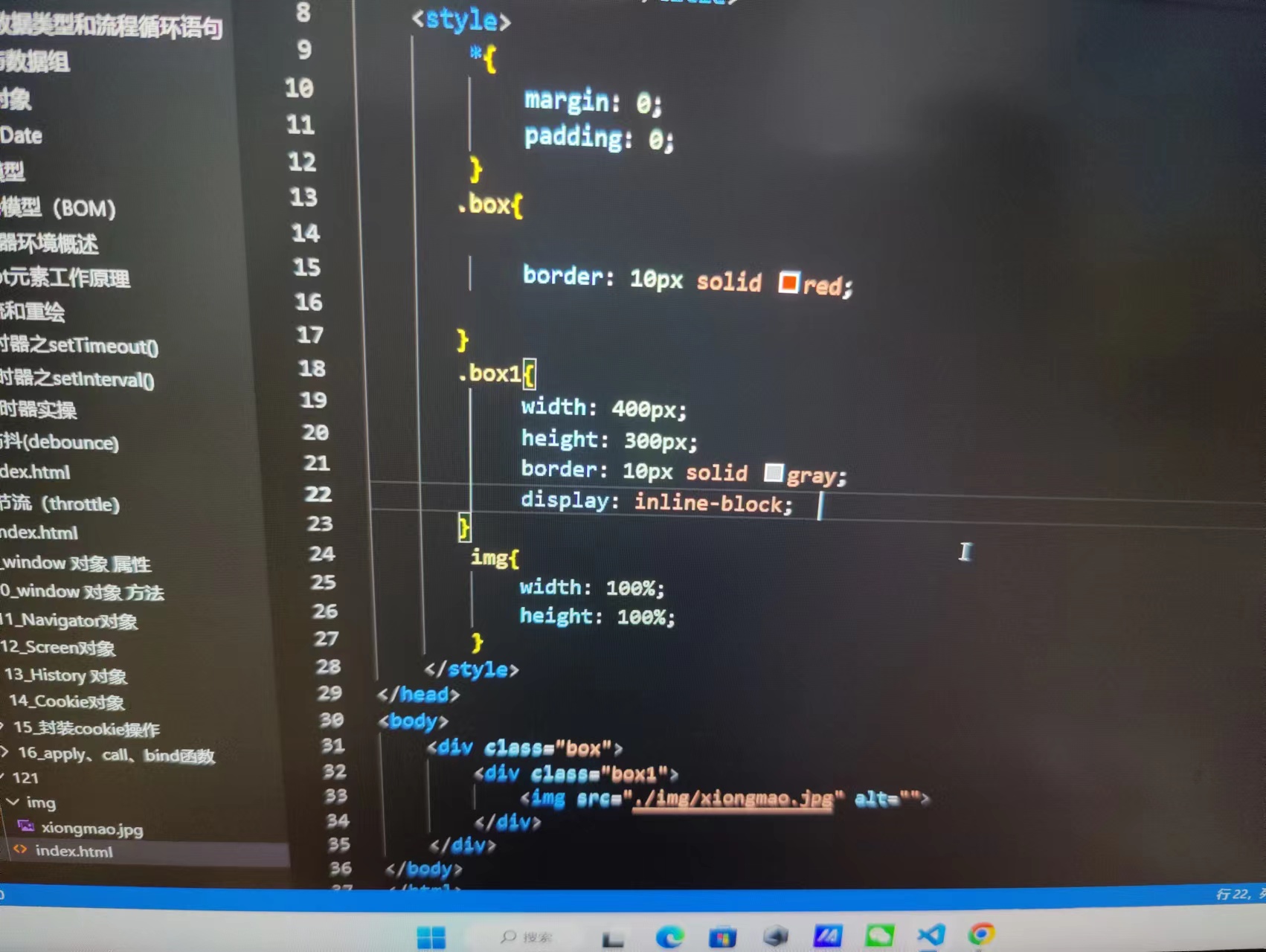