为什么我的也是直角不是圆角
<!DOCTYPE html>
<html lang="en">
<head>
<meta charset="UTF-8">
<meta http-equiv="X-UA-Compatible" content="IE=edge">
<meta name="viewport" content="width=device-width, initial-scale=1.0">
<title>Document</title>
<style>
.box {
width: 500px;
height: 500px;
}
.left {
float: left;
width: 250px;
height: 250px;
.top {
background-color:pink;
width:250px;
height:250px;
.buttom {
background-color:aquamarine;
.right {
background-color:bisque;
float: right;
</style>
</head>
<body>
<div class="box">
<div class="left">
<div class="top"></div>
<div class="buttom"></div>
</div>
<div class="right"></div>
</body>
</html>
怎么出来的样子是这样的,对比了一下没有啥区别啊
<style>
        .box {
            width: 300px;
            height: 300px;
        }

        .left {
            float: left;
            width: 100px;
            height: 300px;
            background-color: rgb(209, 106, 106);
        }

        .right {
            float: right;
            width: 200px;
            height: 150px;
        }

        .top {
            float: top;
            width: 200px;
            height: 150px;
            background-color: skyblue;
        }

        .bottom {
            float: bottom;
            width: 200px;
            height: 150px;
        }

        .b-left {
            float: left;
            width: 100px;
            height: 150px;
            background-color: blue;
        }
        .b-right {
            float: right;
            width: 100px;
            height: 150px;
            background-color: rgb(44, 191, 183);
        }
    </style>
</head>

<body>
    <div class="box">
        <div class="left"></div>
        <div class="right">
            <div class="top"></div>
            <div class="bottom">
                <div class="b-left"></div>
                <div class="b-right"></div>
            </div>
        </div>
    </div>
</body>
将橙色div隐藏用
display:none;
然后在鼠标悬停的css里写
.:>.{
     : ;
    : ;
    : ;
}
这样可以吗?
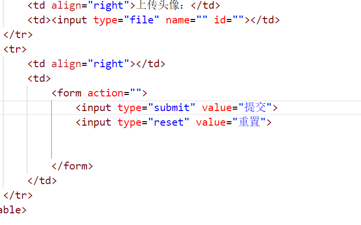
按照视频写的表单,重置按钮没有作用啊
QQ截图20221001195853.png
QQ截图20221001200008.png
    Title

        {
            : ;
        }
        .,.,.{
            : %;
        }
        .{
            : ;
        }
        .{
            : ;
            : ;
            :;
            : ;
            : ;
        }
        .{
            : ;
        }
        .{
            : ;
        }
        .>{
            : ;
            : ;
            : ;
            : ;
            :;
            : ;

        }
        .,.,.,.{
            : ;
        }
        .>{
            : ;
            : ;
            : ;
            : ;
            : ;
        }
        .{
           : ;
            : ;
        }
        .{
            : ;
            : ;
        }
        .{
            : ;
            : ;
        }
        .{
            : ;
        }
        .{
            : ;
            : ;
            : ;
        }
        .{
            : ;
            : ;
        }
        .{
            : ;
            : ;

        }
        .{
            : ;
            : ;

        }
        .{
            : ;
            : ;

        }
        .{
            : ;
        }


                    18
                    200 |
                    3999


                    18 Pro
                    300 |
                    4999


                    17AG
                    865 | 120 Hz
                    3699


                17
                865 | 120 Hz
                3699


                    17 Pro
                    1200+12
                    4299


                    17 Pro
                    1200+12
                    4299
一般表格用多少px
请问栅格系统属于grid布局一种吗?
老师,我想请教一下当鼠标悬停在白色导航上照理说出现的下拉导航里的样式应该是一致的,但是为什么我换了其他图片之后它的布局就完全改变了(布局是统一设计的,只是换了不同的图片想去验证一下);我也下载了源代码直接在源代码相应部分也试着换了其他图片,发现结果都是一样的,布局会紊乱。
<!--白色导航部分-->
    <div class="white-nav">
        <div class="wrap">
            <div class="logo">
                <img class="mi-home" src="images/mi-home.png" alt="">
                <img class="mi-logo" src="images/mi-logo.png" alt="">
            </div>
            <div class="nav-bar">
                <ul>
                    <li>
                        <a href="#">
                            <img src="images/f58837161090e2e04bf687088b2ffe77.gif" alt="">
                        </a>
                    </li>
                    <li>
                        <a href="#">小米手机</a>
                        <div class="nav-bar-list">
                            <div class="wrap">
                                <ul>
                                    <li>
                                        <a href="#">
                                            <div class="img-box">
                                                <img src="images/8729282b199b3ec51e31c1b6b15f3f93.jpg" alt="">
                                            </div>
                                            <p class="name1">小米10至尊纪念版</p>
                                            <p class="price1">5299元起</p>
                                        </a>
                                    </li>
                                    <li>
                                        <a href="#">
                                            <div class="img-box">
                                                <img src="images/b11742a0be47f9d97bb6a13ea580018d.png" alt="">
                                            </div>
                                            <p class="name1">小米11</p>
                                            <p class="price1">3999元起</p>
                                        </a>
                                    </li>
                                    <li>
                                        <a href="#">
                                            <div class="img-box">
                                                <img src="images/b11742a0be47f9d97bb6a13ea580018d.png" alt="">
                                            </div>
                                            <p class="name1">小米10至尊纪念版</p>
                                            <p class="price1">5299元起</p>
                                        </a>
                                    </li>
                                    <li>
                                        <a href="#">
                                            <div class="img-box">
                                                <img src="images/b11742a0be47f9d97bb6a13ea580018d.png" alt="">
                                            </div>
                                            <p class="name1">小米10至尊纪念版</p>
                                            <p class="price1">5299元起</p>
                                        </a>
                                    </li>
                                </ul>
                            </div>
                        </div>
                    </li>
                    <li>
                        <a href="#">Redmi 红米</a>
                    </li>
                    <li>
                        <a href="#">电视</a>
                    </li>
                    <li>
                        <a href="#">笔记本</a>
                    </li>
                    <li>
                        <a href="#">家电</a>
                    </li>
                    <li>
                        <a href="#">路由器</a>
                    </li>
                    <li>
                        <a href="#">智能硬件</a>
                    </li>
                    <li>
                        <a href="#">服务</a>
                    </li>
                    <li>
                        <a href="#">社区</a>
                    </li>
                </ul>
            </div>
            <div class="search"></div>
        </div>
    </div>
/*白色导航部分*/

.white-nav {
    width: 100%;
    height: 100px;
    position: relative;
}

.logo {
    width: 55px;
    height: 55px;
    background-color: #ff6700;
    float: left;
    margin-top: 22.5px;
    position: relative;
    overflow: hidden;
}

.logo>img {
    width: 100%;
    height: 100%;
    position: absolute;
    transition: all .2s;
}

.mi-home {
    left: -55px;
}

.mi-logo {
    left: 0;
}

.logo:hover>.mi-home {
    left: 0;
}

.logo:hover>.mi-logo {
    left: 55px;
}

.nav-bar {
    width: 875px;
    height: 100px;
    float: left;
    line-height: 100px;
}

.nav-bar>ul>li {
    float: left;
}

.nav-bar>ul>li>a {
    color: #333;
    padding: 0 10px;
}

.nav-bar>ul>li>a:hover {
    color: #ff6700;
}

.nav-bar>ul>li:first-child img {
    margin-top: 22.5px;
}

.nav-bar-list {
    width: 100%;
    height: 229px;
    background-color: #fff;
    border-top: 1px solid #eee;
    box-shadow: 0 3px 4px rgba(0, 0, 0, .1);
    position: absolute;
    top: 100px;
    left: 0;
    display: none;
    z-index: 999;
}

.nav-bar-list li {
    width: 204px;
    float: left;
}

.nav-bar-list li:last-child .img-box {
    border-right: 0;
}

.img-box {
    width: 100%;
    height: 110px;
    margin-top: 35px;
    border-right: 1px solid #eee;
    box-sizing: border-box;
    margin-bottom: 16px;
}

.nav-bar-list p {
    line-height: 20px;
    font-size: 12px;
}

.name1 {
    color: #333;
}

.price1 {
    color: #ff6700;
}

.nav-bar li:hover .nav-bar-list {
    display: block;
}

.search {
    width: 296px;
    height: 100px;
    background-color: pink;
    float: left;
}
这是我做的部分的截图:
这是源码我换了图片之后的截图
<style>
        body {
            background-color: #f1f1f1;
        }

        .phone {
            width: 1300px;
            height: 680px;
            margin: 0 auto;
        }

        .left {
            float: left;
            width: 234px;
            height: 680px;
            margin-top: 10px;
            background-color: pink;
        }

        .right {
            float: right;
            width: 1050px;
        }

        .item {
            width: 250px;
            height: 335px;
            float: left;
            margin-left: 10px;
            background-color: rgb(215, 212, 212);
            margin-top: 10px;
            text-align: center;
        }
        .left img {
            width: 234px;
            height: 680px;
        }
        .right img {
            width: 220px;
            height: 220px;
        }
    </style>

</head>

<body>
    <div class="phone">
        <div class="left">
            <img src="./images/1.webp">
        </div>
        <div class="right">
            <div class="item">
                <img src="./images/2.webp">
                <h3>黑鲨4S</h3>
                <p>磁动力升降肩键</p>
            </div>
            <div class="item">
                <img src="./images/2.webp">
                <h3>黑鲨4S</h3>
                <p>磁动力升降肩键</p>
            </div>
            <div class="item">
                <img src="./images/2.webp">
                <h3>黑鲨4S</h3>
                <p>磁动力升降肩键</p>
            </div>
            <div class="item">
                <img src="./images/2.webp">
                <h3>黑鲨4S</h3>
                <p>磁动力升降肩键</p>
            </div>
            <div class="item">
                <img src="./images/2.webp">
                <h3>黑鲨4S</h3>
                <p>磁动力升降肩键</p>
            </div>
            <div class="item">
                <img src="./images/2.webp">
                <h3>黑鲨4S</h3>
                <p>磁动力升降肩键</p>
            </div>
            <div class="item">
                <img src="./images/2.webp">
                <h3>黑鲨4S</h3>
                <p>磁动力升降肩键</p>
            </div>
            <div class="item">
                <img src="./images/2.webp">
                <h3>黑鲨4S</h3>
                <p>磁动力升降肩键</p>
            </div>
        </div>
    </div>
</body>
这个注释标签<!--wode-->
中间必须要有空格吗?
栅格系统的实现关键是引入的grid.css是吗
想让盒子的背景图模糊但是盒子里面的内容不模糊该如何操作,盒子的高度是内容撑开的
 <style>
        @media screen and(max: width 768px){
            body{
                background-color: red;
            }
        }
        @media screen and screen(min-width: 768px)and(max-width 992px){
            body{
                background-color: green;
            }
        }
        @media screen and(min-width: 992px){
            body{
                background-color: blue;
            }
        }
    </style>
老师,颜色出不来啊?
非常抱歉给您带来不好的体验!为了更深入的了解您的学习情况以及遇到的问题,您可以直接拨打投诉热线:
我们将在第一时间处理好您的问题!
关于
课程分类
百战未来微信公众号
百战未来微信小程序
©2014-2026百战汇智(北京)科技有限公司 All Rights Reserved 北京亦庄经济开发区科创十四街 赛蒂国际工业园网站维护:百战汇智(北京)科技有限公司 京公网安备 11011402011233号 京ICP备18060230号-3 营业执照 经营许可证:京B2-20212637


 怎么出来的样子是这样的,对比了一下没有啥区别啊


 京公网安备 11011402011233号
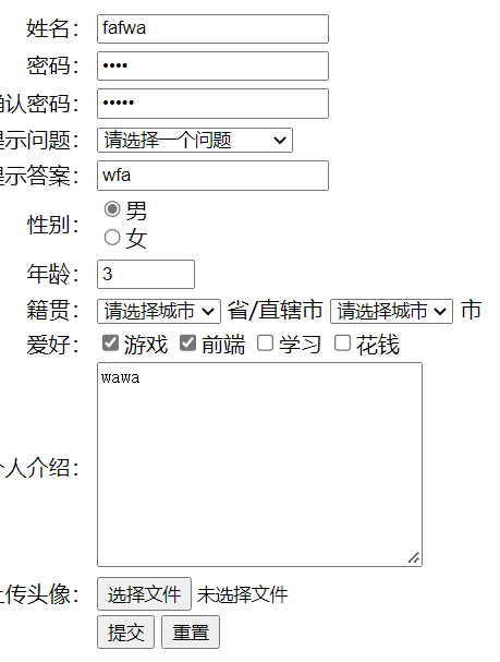