<table border="1" width="500" height="500">
<caption>表格名字</caption>
<thead>
<!-- 表格头部 -->
<th>姓名</th>
<th>年龄</th>
</thead>
<tbody>
<tr>
<td>小米</td>
<td>30</td>
</tr>
<td>阿里</td>
<td>40</td>
</tbody>
<tfoot>
<td>京东</td>
<td>50</td>
</tfoot>
</tablel>
这个代码中tfoot中的表格高度为什么不能改
为啥li设置浮动的,要ul清除浮动
elc-box中最后一个盒子中 浏览更多 设置宽高不生效 字体图标大小也不生效(字体图标不显示这个问题也有疑问)
<!DOCTYPE html> <html lang="en"> <head> <meta charset="UTF-8"> <meta name="viewport" content="width=device-width, initial-scale=1.0"> <title>小米广告部分</title> <link rel="icon" href="../images/favicon.ico"> <link rel="stylesheet" href="../css/reset.css"> <link rel="stylesheet" href="小米.css"> </head> <body> <div class="content"> <div class="wrap"> <!-- 家电部分 --> <div class="elc"> <div class="elc-nav"> <a href="#"> <img src="../images/41d16e66381cfeda7b6b39ab67678d5e.jpg" alt=""> </a> </div> <h2 class="title">家电 <a href="#"> <span>热门</span> <span>电视影音</span> </a> </h2> <div class="elc-box"> <div class="items-2"> <a href="#"> <img src="../images/116fc43816b87192be4e67cf762e8da5.jpeg" alt=""> </a> </div> <div class="items-1"> <a href="#"> <img src="../images/03a9e7e96a09d256ca1badeec186c859.jpg" alt="" class="img1"> <h3 class="name2">小米全面屏电视65英寸 E65X </h3> <p class="desc2">全面屏设计</p> <p class="price2">2999元<del class="original">3299元</del></p> </a> </div> <div class="items-1"> <a href="#"> <img src="../images/20d36fbaa18625e4fe507af31e4e9f83.jpg" alt="" class="img1"> <h3 class="name2">全面屏电视E43K </h3> <p class="desc2">全面屏设计,海量内容</p> <p class="price2">1349元<del class="original">1500元</del></p> </a> </div> <div class="items-1"> <a href="#"> <img src="../images/9d8674cd21c486feff5328772ab9cf01.jpg" alt="" class="img1"> <h3 class="name2">小小米电视4A 70英寸 </h3> <p class="desc2">大屏更享受</p> <p class="price2">3599元<del class="original">3900元</del></p> </a> </div> <div class="items-1"> <a href="#"> <img src="../images/6bed167fc905bab57dee478bcf1e5e0d.JPG" alt="" class="img1"> <h3 class="name2">米家互联网对开门冰箱 540L </h3> <p class="desc2">重磅新品福利特惠</p> <p class="price2">2999元<del class="original">3600元</del></p> </a> </div> <div class="items-2"> <a href="#"> <img src="../images/dfbdabe36b2d630d57a015e6fb5eb3ea.jpg" alt=""> </a> </div> <div class="items-1"> <a href="#"> <img src="../images/b8c63a2024528fe5410ebe669b7d2407.jpg" alt="" class="img1"> <h3 class="name2">Redmi全自动波轮洗衣机1A 8kg</h3> <p class="desc2">一键操作,父母都爱用</p> <p class="price2">849元<del class="original">899元</del></p> </a> </div> <div class="items-1"> <a href="#"> <img src="../images/74e573c4c0d89048392d14831cc507d5.jpg" alt="" class="img1"> <h3 class="name2">Air 13.3" 2019款 </h3> <p class="desc2">新一代独立显卡</p> <p class="price2">6299元</p> </a> </div> <div class="items-1"> <a href="#"> <img src="../images/7e5f89adf98ab3fccb34012b5209cd58.jpg" alt="" class="img1"> <h3 class="name2">米家互联网烟灶套装(天然气)</h3> <p class="desc2">点火排烟,风随火动</p> <p class="price2">2298元</p> </a> </div> <div class="items-last"> <div> <a href="#"> <img src="../images/1612c93ad4756215774a0dbec7a81bb2.jpg" alt=""> <h3 class="name2">米家电烤箱 </h3> <p class="price2">279元</p> </a> </div> <div> <a href="#"> <div class="more">浏览更多 <small>电视影音</small> </div> <i class="icontfont"></i> </a> </div> </div> </div> </div> </div> </div>
.elc-nav{ width:100%; height:120px; margin:22px 0; } .title{ color:#333; font-size:22px; font-weight:200; line-height:58px; text-align:left; } .title>a{ color:#424242; font-size:12px; line-height:58px; float:right; } .title>a:hover{ color:#ff6700; } .elc-box{ width:100%; height:614px; } .items-1{ width:234px; height:260px; background-color:#fff; margin:0 0 14px 14px; padding:20px 0; text-align:center; float:left; transition:all .2s linear; } .img1{ width:160px; height:160px; margin-bottom:18px; } .name2{ width: 214px; height: 21px; color: #333; font-size: 14px; line-height: 21px; margin: 0 auto 2px; white-space: nowrap; overflow: hidden; text-overflow: ellipsis; } .desc2{ width: 214px; height: 18px; color: #b0b0b0; font-size: 12px; line-height: 18px; margin: 0 auto 10px; white-space: nowrap; overflow: hidden; text-overflow: ellipsis; } .price2{ color: #ff6700; font-size: 14px; } .title span{ margin-left:30px; transition:border .3s; } /* 鼠标悬停在家电标题右侧部分的span元素上,橘色的下边框显示 */ .title span:hover{ border-bottom:2px solid #ff6700; } .items-2{ width:234px; height:300px; background-color:#fff; margin-left:0; padding:0; float:left; } .items-last{ width:234px; height:300px; margin-left:14px; float:left; position:relative; } .items-last>div{ width:234px; height:143px; background-color:#fff; padding-top:50px; box-sizing:border-box; } .items-last>div:first-child{ margin-bottom: 14px; } .items-last>div:last-child>.more{ width:94px; height:45px; font-size:18px; color:#333; margin:0 110px 0 30px; float:left; } .more>small{ display:block; color:#757575; font-size:12px; } .items-last>div:last-child>i{ /* 转化为块级元素设置宽高 */ display:block; color:#ff6700; font-size:48px; line-height:48px; float:left; } .items-2 img{ width:100%; height:100%; } .price2>del{ color: #b0b0b0; margin-left:0.5em; } .items-last img{ width:80px; height:80px; position:absolute; top:32px; right:20px; } .items-last h3{ position:absolute; top:50px; left:-40px; } .items-last p{ position:absolute; top:76px; left:40px; } /* 鼠标悬停在家电部分主体小盒子上,均有三个方向上的盒阴影 */ .items-1:hover,.items-2:hover,.items-last>div:hover{ box-shadow:0 15px 30px rgba(0,0,0,.1); transform:translate(0,-2px); }
<style> * { margin: 0; padding: 0; } body { background-color: aliceblue; } .container { width: 1080px; margin: 0 auto; } .container ul { overflow: hidden; clear: both; } .container ul li { position: relative; float: left; list-style: none; background-color: #fff; margin: 10px 9px 0 0; width: 260px; height: 375px; } .container ul li:nth-child(4n) { margin-right: 0; } .container ul li a { display: block; width: 100%; height: 100%; text-align: center; text-decoration: none; padding-top: 20px; } img { width: 250px; height: 230px; } .container ul li a .text { width: 100%; margin-top: 20px; } .text .name { display: block; color: #333; font-size: 16px; margin-bottom: 3px; } .text .desc { display: block; color: #999; font-size: 15px; } .text .price i { font-style: normal; font-size: 17px; color: red; } .text .price { display: inline-block; color: red; font-size: 22px; /* padding-left: 14px; */ } .text .price em { font-size: 16px; font-style: normal; } .prodect-sign { position: absolute; top: 15px; left: 20px; display: block; width: 55px; height: 55px; background-color: pink; border-radius: 60%; line-height: 55px; color: #fff; font-size: 16px; } </style> </head> <body> <div class="container"> <ul> <li> <a href="#"> <img src="./img/1.webp" alt=""> <div class="text"> <span class="name">小米 11Pro</span> <span class="desc">限时优惠,抢购吧</span> <span class="price"><i>¥</i>1999<em>起</em></span> </div> <span class="prodect-sign">免息</span> </a> </li> <li> <a href="#"> <img src="./img/2.png" alt=""> <div class="text"> <span class="name">小米 12Pro</span> <span class="desc">限时优惠,抢购吧</span> <span class="price"><i>¥</i>2999<em>起</em></span> </div> <span class="prodect-sign">免息</span> </a> </li> <li> <a href="#"> <img src="./img/1.webp" alt=""> <div class="text"> <span class="name">小米 11U</span> <span class="desc">限时优惠,抢购吧</span> <span class="price"><i>¥</i>2222<em>起</em></span> </div> <span class="prodect-sign">免息</span> </a> </li> <li> <a href="#"> <img src="./img/2.png" alt=""> <div class="text"> <span class="name">小米 12U</span> <span class="desc">限时优惠,抢购吧</span> <span class="price"><i>¥</i>3333<em>起</em></span> </div> <span class="prodect-sign">免息</span> </a> </li> </ul> </div> </body>
偷懒用老师写的尺寸,但是看着好大啊,对于类名还是不会起名字,不会管理
0c5d58829814f438a9967557a226f07.png
为什么这里要用h3?用p的效果也是一样的
.phone-box-right {
width: 992px;
height: 614px;
float: left;
}
.item {
width: 234px;
height: 300px;
background: #fff;
padding: 20px 0;
margin: 0 0 14px 14px;
box-sizing: border-box;
transition: all 0.2s linear;
宽度计算(234+14).4=992
为啥高度计算(300+14).2>614
老师,这里父级和子级的定位position的值可以设定成不一样吗? 设置position的值有什么具体要求吗?
老师为什么我的复制是ctrl+D。而ctrl+alt+向下不起作用呢
<style> *{ margin:0; padding:0; } div{ background-color:plum; width:800px; height:60px; } ul{ display:flex; list-style-type: none; display:inline-flex; background-color:lightpink; } li{ flex-grow:1; } li a{ text-decoration: none; color:black; line-height:60px; } </style> </head> <body> <div> <ul> <li><a href="">首页</a></li> <li><a href="">项目</a></li> <li><a href="">导航</a></li> <li><a href="">返回</a></li> </ul> </div> </body> </html>
老师为什么我的flex-grow不生效
不知道老师是否能看到,如果能看到,麻烦老师帮我解答下
一、老师,这是这个周的是操作业,我遇到的问题是 middle2 达不到作业的要求,没有紧贴盒子底部 <!DOCTYPE html> <html lang="en"> <head> <meta charset="UTF-8"> <title>Title</title> <style> .box1{ width: 100% height: 50px; background-color: blue; } .wrap{ width: 700px; height: 50px; margin: 0 auto; background-color: cadetblue; padding-top: 10px; } .box2{ width: 700px; height: 100px; background-color: cadetblue; margin: 10px auto 0px auto; padding-top: 20px; } .box3{ width: 700px; height: 20px; background-color: gray; margin: 0 auto; } .box4{ width: 700px; height: 40px; background-color: green; margin: 0 auto; padding-top: 50px; } .box5{ width: 700px; height: 250px; background-color: gray; margin: 0 auto; margin-top-40px; } .box6{ width: 700px; height: 20px; background-color: dodgerblue; margin: 10px auto 0px auto; } .no1{ padding-left: 50%; padding-right: 50%; } .no2{ padding-left: 50%; padding-right: 50%; } .no3{ padding-left: 50%; padding-right: 50%; } </style> </head> <body> <div class="box1"> <div class="wrap"><span class="no1">top1</span></div> </div> <div class="box2" ><span class="no2">middle1</span></div> <div class="box3"></div> <div class="box4" ><span class="no3">middle2</span></div> <div class="box5"></div> <div class="box6"></div> </body> </html>
邮箱那里弹出来的提示是html自带的吗,还是和浏览器有关?
复制图片地址,粘贴过来,运行不显示图片。复制过去没有.gif后缀怎么办
为什么不居中呢
点击a跳转到块级元素,块级元素是什么意思?
非常抱歉给您带来不好的体验!为了更深入的了解您的学习情况以及遇到的问题,您可以直接拨打投诉热线:
我们将在第一时间处理好您的问题!
关于
课程分类
百战程序员微信公众号
百战程序员微信小程序
©2014-2025百战汇智(北京)科技有限公司 All Rights Reserved 北京亦庄经济开发区科创十四街 赛蒂国际工业园网站维护:百战汇智(北京)科技有限公司 京公网安备 11011402011233号
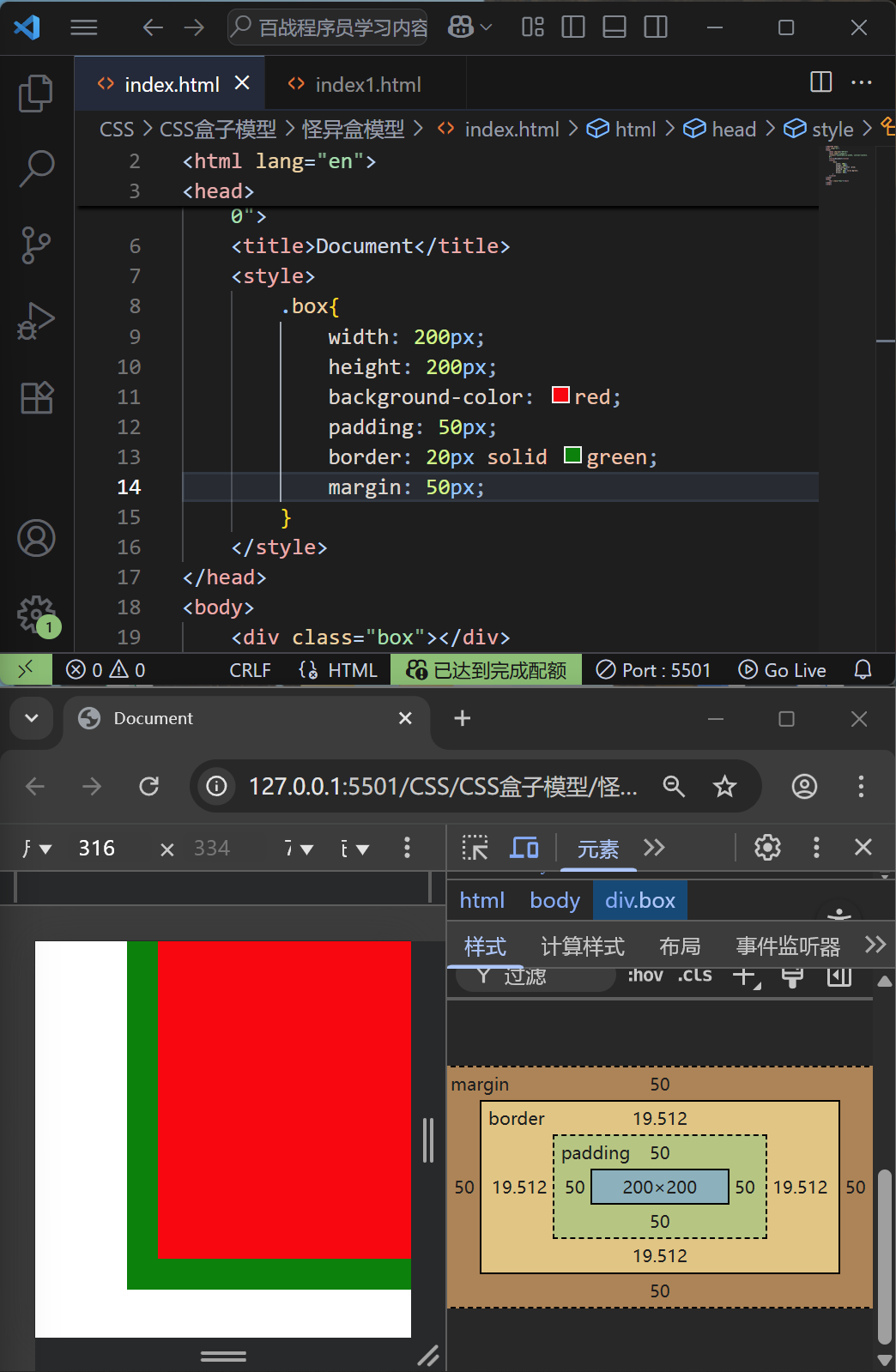
 京ICP备18060230号-3 营业执照 经营许可证:京B2-20212637